title image

It's Payback Time

by: Ted Carlson

Navigating this Article:

This article is currently only supported in desktop browsers using Google Chrome. If you’re currently reading this another way, please switch to Chrome on desktop or your reading experience will be compromised.

Based on the size of the dynamic data visuals in this project, scrolling too fast through this article will not play well with all graphs. Scrolling back up through this project is also not fully supported, so if you want to rewatch a visualization, you may need to do some combination of scrolling up or reloading the page.

Setting your page zoom to 100% should work to show all features in this article, but if you find at any point that images are getting cut off, zooming out a step should work.

About the Project:

This article aims to illustrate the extent of the student loan crisis through both written word and dynamic data visualizations. It was inspired by similar work that has been done at The Pudding, Bloomberg, The Upshot, and The Guardian.

In order to best integrate my article with the data visualizations, Scrollama, a JavaScript library developed by Russell Goldenberg at The Pudding, was used. It uses IntersectionObserver instead of scroll events to trigger scroll-based interactives, and was by far the simplest and best performing library I tested to make my article interactive. You can check out basic examples of this library at the GitHub repository linked above.

Article Contents:

This article is broken down into five major sections:
1. An introduction to the history of student loans with a line graph of school tuition and government grant spending.
2. Problem diagnoses with a line graph of credit default rates over time.
3. Student debt symptoms illustrated with emojis.
4. A cluster analysis of student debt attributes for each college in the U.S.
5. Summary and wrap-up.

The animated line graphs in section 1 and 2 were created using D3. The illusion of drawing the line is created by making the lines “dashed”, but having the dash extend over the length of the entire line, making it completely hidden. Then, on a page trigger, the dash can be moved one line length, so it looks like the line is being drawn on the page.

The parallax effects on the images between the sections were created using the jQuery Parallax plugin by Ian Lunn. This allows overlayed images to scroll at different rates from one another, giving the illusion of depth in a webpage.

The animations in the emoji section were created using TweenMax, which is an animation tool created by GreenSock. These animations were called by Scrollama on specific page events.

The cluster analysis contains two dynamic charts. First, there is the T-SNE. This graph is a basic scatterplot created in D3 that allows the user to zoom in and out by scrolling.

Finally, the most important data visualization element is the clustered bubbles. These were created using d3-force, which is a module that simulates physical forces on the individual items in a D3 chart, in this case, bubbles. An important aspect of this visual is that every bubble representing a college maintains a consistent position on the chart, even as the article is applying size, color and position changes to them. Although there are some performance issues associated with giving each college in the U.S. an individual bubble, performing a comprehensive analysis was more important to me.

As the end of my master's program fast approaches, I'm starting to feel the graduate school version of the "Sunday scaries." These are not, however, caused by capstone projects, the stress of finding a full-time job, or even the threat of another Chicago winter. This, instead, is a fear that haunts 71% of all university graduates nationwide: student loans.

Student loans seem like an idea as old as time itself, but student lending is a rather novel concept. Early in United States history, colleges and universities either did not charge tuition or had very low rates. At that time, the biggest cost of getting an advanced degree was moving and living expenses. Despite the modest expense, the cost of moving away from home was still prohibitive for many working class families. This led to colleges mostly made up of students with generational wealth.

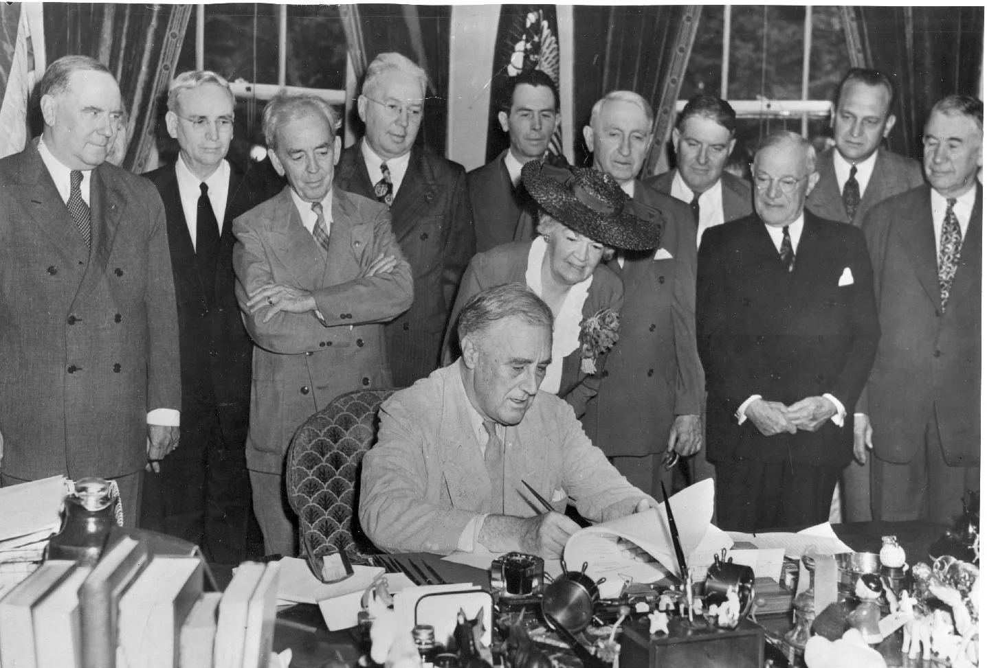
This all changed in the 1920s with the roaring economy. Suddenly, the cost of college was within reach, even if your last name wasn't Rockefeller. By the end of the 1920s, 20% of college-age Americans would enroll in higher education. The middle of the century continued that trend as the government prioritized access to higher education for an even wider group of people. It started with the GI Bill, which guaranteed free college or vocational school for veterans after World War II. Then, 1965 saw the passing of the Higher Education Act, which helped lower-income students afford college when they wouldn't have been able to on their own. This also marked the first time the federal government administered student loans, and helped establish many of the financial aid programs we know today.

president FDR
FDR signing the G.I. Bill into law in 1944

These government programs caused attendances at colleges to skyrocket. In the decade after the passing of the Higher Education Act, attendance at public colleges more than doubled. This increase in attendance caused the limited government grant money to be spread very thin.

This is when students begin rushing to take out loans to pay for their advanced degrees, which were becoming more and more necessary to enter into the work-force.

Starting in the mid-1970s, college tuition began increasing at a faster rate than the rest of the economy. This trend could partially be attributed to the demand for higher education exceeding the supply. But it certainly was worsened by the massive state funding cuts to higher education that began in the 1980s and have, essentially, remained to this day.

By 1986, students had racked up $10 billion dollars in student loans. Let's take a look at where we stand today.

mountain background money mountain

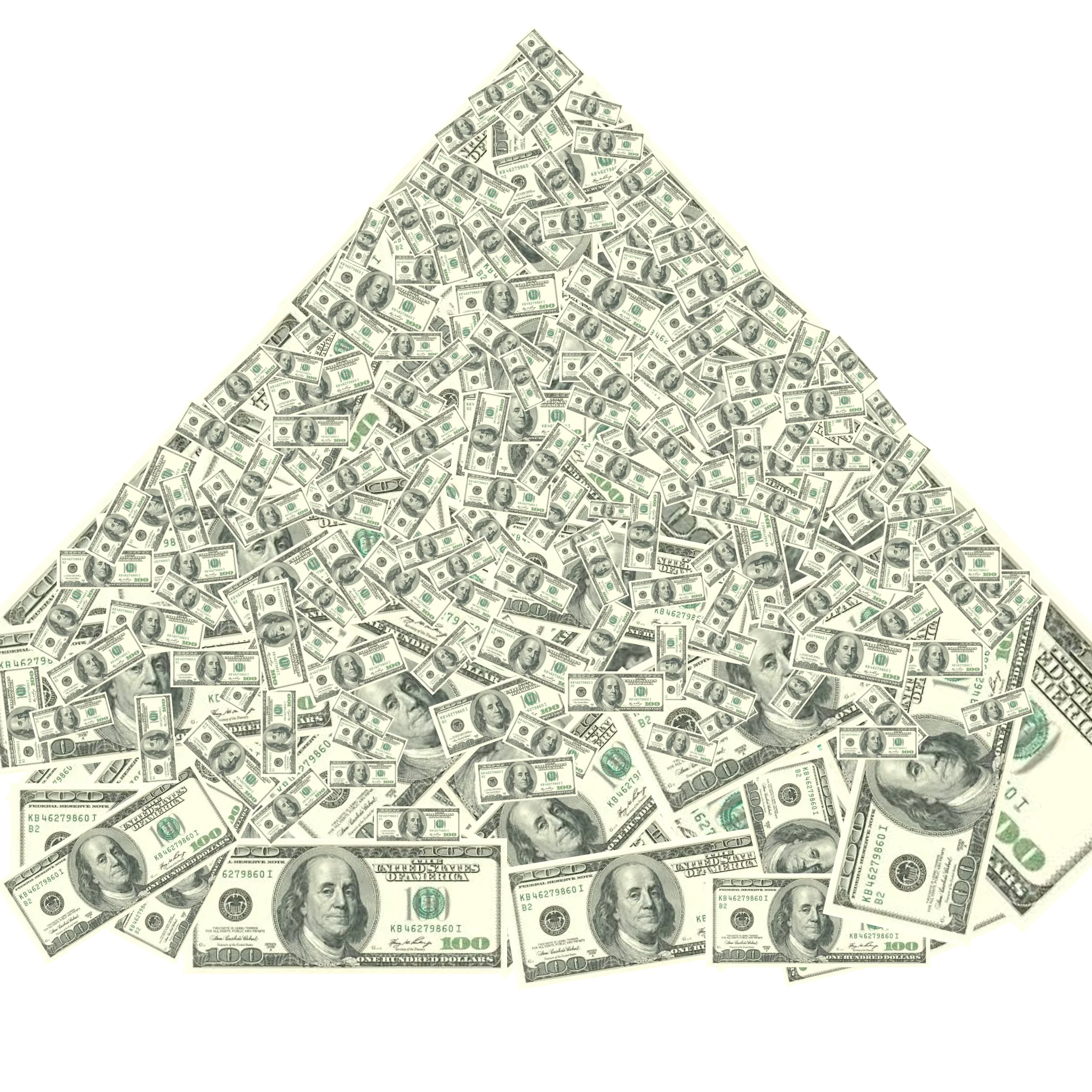
This mountain represents the current $1.6 trillion dollars of existing student debt.

This amount of money boggles the mind.

So how did we get here..?

This is the average price of tuition in the United States at public and private schools since 1988

This dark blue line represents the maximum Pell Grant amount awarded to students.

As you can see, the Pell Grants have failed to keep up with rising tuition, which causes people to take out more in loans to make up the difference.

This light blue line is the amount of money the government has spent on higher education per full-time student.

As with the maximum Pell Grant awarded, government funding for higher education has completely plateaued for the last three decades

quote image

Government funding getting slowly drained from higher education has led to colleges scrambling to find revenue from other sources. And tuition increases have proved an easy way to shift that burden onto the student: A college degree has become essential to find a well-paying job in the modern work-force, as almost every job created since the recession has gone to a college graduate. This gives colleges enormous leverage over students, allowing them to charge essentially any price they want.

Another source of school funding is philanthropy. Colleges will gladly accept money from private citizens, foundations or corporations. If you give enough, they might even let you put your name on a building (check out the Northwestern Pritzker School of Law or Carnegie Mellon University). If you'd like your own naming rights, you can find Northwestern's handy guide here.

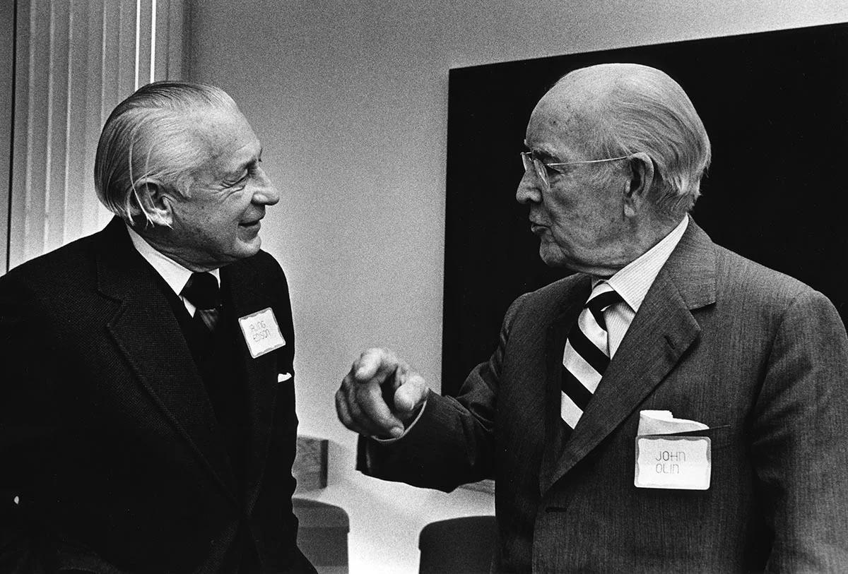
While naming rights to a building or bench may seem innocuous enough, decreased government funding for higher education means colleges are more desperate for money, which can lead to them being held captive by the ideologies of their donors. John M. Olin and the Koch brothers are among the most prominent of America's elite to realize they could use college philanthropy to their political advantage. By founding entire college departments and hiring professors preaching corporation-friendly ideologies--and even creating a new approach to jurisprudence called "Law and Economics"--these billionaires have been able to launder their interests through respected universities.[1]

photo of John M Olin
John M. Olin inside the Olin Business School at Washington University in St Louis

Yet another way for colleges to bring in cash is through investing. An endowment is essentially how much money a college has in the bank, and it gets there either through donations or other funding sources. But the more important aspect of an endowment is how it gets spent--or not. More than 100 U.S. universities currently have an endowment of more than $1 billion [2] . Northwestern University currently has a $11.1 billion endowment, and Harvard, of course, leads the way with $38.3 billion in the bank. This money, and the returns it generates, can be used for financial aid programs, new facilities, or athletics. More often, however, it's just reinvested back into the endowment to make even more money for the next year.

This may seem fine, and in a vacuum, it is! Endowments are often thought of as a sort of rainy day fund--some extra money to get a school through a major recession or an unexpected cut in funding. However, more and more, universities are obsessed with maintaining their endowment's value at all costs. And I mean that quite literally: Yale has spent $480 million in one year on private equity fund managers to manage their endowment. Compare that to the $170 million that was given to their students in the same year in the form of tuition assistance, fellowships and prizes[3] . You can see why some people call large universities banks with an education wing.

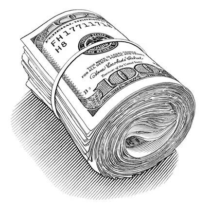
roll of money One could reasonably believe that a college is free to do with its endowment as it wishes, and if they wish to hoard all of this wealth, then that's their business. But the reality is that the entire endowment system is heavily subsidized by taxpayers. So this stock-piling of assets, wherein the largest returns are going to hedge fund managers rather than students, is happening at a cost to all of us. For elite private universities, the average taxpayer subsidizes $13,000 per student per year, and at prestigious public universities, the average subsidy is closer to $23,000 per student per year. Princeton leads all schools with $105,000 of taxpayer subsidy per student per year[4] .

Despite all the money these elite universities pay for investors to handle their endowment, it's not quite clear how good the investors actually are at their job. Not a single Ivy League endowment has beaten the returns of a simple 60/40 portfolio (60% bonds, 40% stocks) in the years since the 2008 recession [5]

But do tuition increases, which come in the wake of shrinking government funds and endowment hoarding, really affect students post graduation? After all, they still get an advanced degree, which they can use to land a great job. What's the problem here?

One in seven Americans owes a portion of that giant mountain of debt you saw in the beginning. That's 44 million people. And out of those people, 5.1 million of them are in default [6] . Let's take a look at how that compares to rates of default for debt linked to the Great Recession.

Here's what the rate of default on mortgages was in the United States from 2003 to 2017

The rate peaked around 8% in the middle of the recession, but has since leveled off to approximately its level before the recession

The rate of default on credit cards was even worse

However, credit card default rates are almost always higher than mortgages, and they also returned to normal post-recession.

Here are the default rates for auto loans and revolving debt

Finally, let's look at the rate of default on student loan debt

Not only is this rate currently past the rate of default during the peak of the housing crisis ...

... the default rate has never gone down, even post-recession

How high can it go?

What will this graph look like if there's another recession?

image of quote

Student debt is a $1.6 trillion crisis we can no longer ignore. Although we don't know what this crisis is going to look like in the future, we know that defaulting, or even the threat of defaulting, on student loan debt is causing students to alter their lives in massive ways.

People get advanced degrees in order to gain increased flexibility in their careers: More jobs are willing to hire you with an advanced degree; the connections you make in just a few years at college would take a lifetime of networking to make in the work-force; and higher education can open more doors for you right out of high school than essentially any other career path can. But how many is it closing?

As the student debt burden continues to climb, which life choices are being altered by your pursuit of an advanced degree? [7]

baby emoji worker emoji grandma emoji house emoji

10% of people said student debt has kept them from having a baby when they wanted

20% of people haven't been able to change jobs because of their student debt burden

30% have delayed saving for retirement

Nearly half of survey respondents said their student debt prevented them from buying a home

Delaying children? Staying in a job you don't like? Continuing to rent an apartment when you'd rather own a home, or paying back student debts when you'd rather be starting a nest egg? The enormous weight of student debt has pushed itself into nearly every facet of life.

While op-ed columnists love pointing out how millennials are "killing" the real estate industry, relationships and the auto industry , it seems quite obvious that this has less to do with youthful arrogance or spite than the simple fact that millennials don't have much spending power--at least compared to the generations that came before [8] .

And while student debt can impact everyone's life choices, women and people of color are especially hard hit.

quote photo

There are thousands of colleges in the United States. Are they all contributing to the debt crisis at the same rate? What traits do these colleges have that distinguish themselves from each other in terms of debt? These were the questions I sought to answer in my final analysis.

First, I created a dataset using the College Scorecard, which is a tool the US government made to help students compare colleges in key metrics. The metrics I decided would most apply to this study were average grant aid awarded, average loans awarded, number of undergraduate students, median debt after graduation, median earnings 10 years after graduation, the default rate for students within three years of graduation, and the average net cost of the school (sticker price minus average aid).

Since these metrics were distributed across multiple College Scorecard datasets, I had to join them by a common school ID. Then, I had to make sure these schools had enough public data for me to analyze. College Scorecard suppresses data from any field that contains fewer than 30 students out of privacy concerns. I started out with 3,626 schools, but had to narrow this down to 3,180 after about 450 school had debt at graduation or median earnings as “Privacy Suppressed.” The rest of the schools had their data normalized and run through the scikit-learn K-means package to group them into individual clusters.

K-means is an unsupervised machine learning algorithm which takes data with many dimensions like these schools, and assigns them to k different clusters by minimizing the distance between these schools and the center of the cluster in which they're assigned. The first step in this analysis is to create an elbow plot to decide how many clusters to sort the schools into.

Elbow Plot

elbow plot
The y-axis here tells us the sum of squared distances between the individual points and the center of their clusters. The x-axis tells us how many clusters were created. Adding additional clusters will always decrease the sum of squared distances, but adding too many clusters makes them less practical or intuitive, and could potentially overfit the data. Choosing the number of clusters is more art than science, but five clusters for this dataset seems to be the point where the benefit from adding additional clusters becomes marginal.

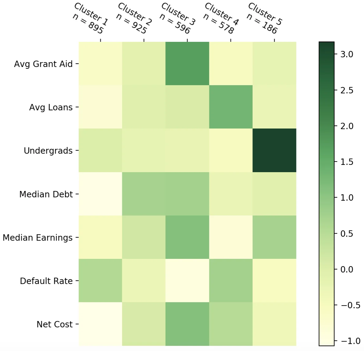
As indicated at the top of this cluster heat map, five clusters also gives us fairly even cluster sizes, which is ideal. Now let's take a look to see if we can interpret what these clusters represent.

Cluster 1 schools have low cost and low median debt, but their default rate is tied for highest among the clusters. A lot of cluster 1 schools are community colleges or tech schools. Examples include Illinois Valley Community College, North Georgia Technical College and New Mexico Junior College. We can generalize and call these "trade schools."

Cluster 2 schools are pretty average across the board, except they typically have the highest debt. Examples of cluster 2 schools are the Art Institute of Seattle, Chicago State University and Prairie View A&M University. This cluster is difficult to name because it's the largest, and it also encompasses the widest variety of schools. But let's call these "mid-level regional colleges."

Cluster 3 schools have the highest costs and highest median debt--but also receive the highest earnings, get the most financial aid, and have the lowest default rate. These tend to be very prestigious and expensive schools, populated with wealthy students that can typically afford to pay back the debt. Examples of these schools are Northwestern University and all of the Ivys. We'll call this cluster "elite universities."

Cluster 4 schools seem to be the most dangerous schools, at least in terms of student loans. Their costs are above average, they easily take out the most loans, and the default rates are also quite high. These schools also have the lowest average earnings among the clusters. Examples of these schools are the Southwest Institute of Healing Arts, Commonwealth Institute of Funeral Service, and the Art Institute of Indianapolis. Let's call these "high risk schools."

Lastly, we have cluster 5 schools, which are mostly made up of giant state schools. They have by far the highest attendance, but they make up for that with pretty high earnings, and fairly low cost and default rates. Examples of these schools are Purdue University, the University of Wisconsin, and Ohio State University. We'll just call these "large public colleges."

This heatmap is useful for seeing the general traits of the clusters, but using some more advanced analytical techniques, we can look at where each individual school falls in relation to each other.

cluster plot

t-Distributed Stochastic Neighbor Embedding or "t-SNE" is a dimensionality reduction technique which allows users to see high-dimensional datasets in a dimension better suited for data visualization.

Here, I plotted every college in the United States and the seven attributes associated with them from the K-means clustering on a two-dimensional space. Each school is colored by the cluster with which it's associated. Generally, the points on this plot that are closer together are more similar than those that are more separated.

Although the schools from each cluster are generally grouped together, you can see some areas where schools from different clusters overlap. These are schools that share some common characteristics from both clusters, but ultimately came closer to the cluster they were assigned in the seven dimensional space.

For example, if you hover your mouse over the elite schools in the top right, you notice the schools farthest away from everything else (farthest top right) are ultra-elite schools like Princeton, Harvard and MIT. This is because these schools share very few characteristics with anything else on the plot. But there are also two points in the elite universities cluster that are grouped in the middle of the schools from the large public schools cluster. These are the University of Virginia and the University of New Hampshire. These schools share a lot of similar attributes with schools in the large public school cluster, but ultimately ended up closer to the elite universities when taking all seven dimensions into account.

You can explore the graph on your own by hovering over the points to display their attributes. If the tooltip gets in the way, you can click your mouse to make it temporarily disappear. Once you hover over one of the points, all of the points from the other clusters will fade to grey to give you a better picture of where that cluster stands in the greater scheme. If you want to take a closer look at a section of the map, you can zoom in by scrolling your mouse and pan around the screen by clicking and dragging.

Now that we know a bit about these clusters, let’s explore them more in-depth in a less static way.

I’ve created a bubble below for every school in the college scorecard dataset. You can hover your mouse over them to see their cluster attributes.

Let’s see what they look like when they’re organized by their clusters.

As we already know, the clusters are about evenly split except for the fifth one. Feel free to hunt around for a school that is meaningful to you, but first let me highlight a few that are of interest to me.

This red dot is the University of Wisconsin, where I went to undergrad. It's a very large public university with a low cost and high relative earnings. This leads to a very low default rate of 1.6%. All of these attributes are characteristic of this cluster.

This purple dot is Northwestern University, where I’m currently attending graduate school. Northwestern is included in the cluster that I call “elite colleges." These typically have a higher cost and higher debt than other schools, but they make up for it by giving out much more grant aid (median of $38,500 vs UW’s median of $6,500) and graduate students with higher earnings.

The Ivy League schools are probably the most classic examples of this cluster.

Here is every college in Illinois. As you can see, this is a diverse group. Here you’ll find everything from large public schools like the University of Illinois to much smaller operations like McHenry County College.

You can get a sense for the attributes of each cluster by hovering your mouse over the schools in each one, though perhaps a better way is to actually use some size and color.

This is what it looks like when the size of the bubbles correspond to the size of the undergraduate population at each school. It’s no surprise that the fifth cluster has most of the massive schools. But now let’s size these bubbles using a measure that has to do with the debt crisis.

Here the bubbles are sized by the median debt a student has coming out of college. It’s pretty easy to see that the schools with the most debt fall into clusters 2 and 3. Let’s next bring in another variable we haven’t seen before to help explain this phenomenon.

Here the clusters are colored by type of school. Although cluster 2 is a mix, clusters 1 and 5 are dominated by public schools, while 3 is overwhelmingly private nonprofits and 4 is a majority of private for-profits. But as we saw in the heat map above, a large amount of debt does not always correlate to a high chance of defaulting. Let’s color the bubbles based on the average default rate for students.

This tells the same story: Although the elite universities in cluster 3 have some of the highest debt out of college, their default rates are some of the lowest--whereas students attending the trade schools and for-profit colleges in clusters 1 and 4 have extremely high rates of default. We already know two of the reasons why this may be based off our analysis.

Students at elite universities get much more aid than students at other schools.

And cluster 1 and 4 schools have by far the lowest median earnings.

When we color the bubbles by gender of the student body, a couple of trends stand out. First, a lot of these schools tend to hover around 40% male, which lines up with recent trends in higher ed. The second trend, however, shows that a lot of the high risk schools in the fourth cluster are more than 80% female.

By coloring the bubbles to look at the proportion of black students in these schools, we see this pattern stand out even more. Almost all of the predominantly black colleges are in clusters 2 and 4. Aside from Howard and Spelman, the elite colleges and large public schools--the ones with the best earning prospects and lowest risks of default--are dominated by non-black students.

There are plenty of interesting ways to combine these College Scorecard attributes in order to show patterns in the data, so I want to give the reader an opportunity to do it themselves. Below, you can choose your own attributes for the size and color of the bubbles. In addition to the attributes I've already described, there's also a color feature included called "change in grant aid," which is the amount of additional grant aid per student a school has received since the recession. A negative value represents a decrease in grant aid per student.

Set Bubble Attributes

Size:    
Color: 

quote image

Whatever your situation is--whether you're a prospective college student or midcareer professional that has yet to see their principal go down; whether you're graduating next to me with six figures of debt; or you already have your debt paid off-- please know that this 👏 system 👏 is 👏 not 👏 normal 👏.

The UK has a similar student debt problem, but their tuition is capped at £9,000 per year [9] . In Germany, tuition has been completely abolished. In fact, there are more than 40 countries around the world that offer free public higher education, including Finland, Sweden, Norway, Greece, Brazil and Turkey. Study at any of these schools (some do offer programs in English) and all you're expected to pay is your cost of living.

earth with graduation hat This is not to say that the United States education system is homogenous. As we've seen, your financial situation after leaving college can vary widely. Going to an elite school will cost you more, but you're unlikely to feel as much of a pinch post-graduation as a person that enrolled in a relatively inexpensive trade school. And regardless of what school you attend, women and people of color are the most affected by debt across the board.

So, aside from enrolling in a Greek college, what can be done about this? As U.S. tuition costs continue to rise, know that something CAN be done to address this. But the powers that be simply choose not to. We are now going on three decades of public school funding cuts that have not only left our colleges and universities desperate for corporate cash and private donations, but have also devastated our K-12 system. We are seeing giant universities act as if they're banks or real estate companies, stockpiling cash and gobbling up property instead of reinvesting in their students.

As we look towards the future of the U.S. higher education system, we need to ask ourselves: Do we consider education a human right? Should access to a proper education depend on you or your family's financial situation? Do we continue to allow the country's elite to launder their wealth and privilege into a degree at a prestigious school, while the working class goes into debt over a technical degree? The United States of America, the wealthiest country in the history of the world, needs to guarantee a tuition and debt free higher education to anybody that wants it.

So, to all those that plan on graduating this year, including each of my classmates: Congratulations. We've earned every ounce of our diplomas, and we'll all move on to bigger and better things. Unfortunately, we'll also join the other 44 million Americans feeding that giant mountain of debt. Because now, it's payback time.

credits image

Thanks to everyone who provided feedback and insight along the way, with special thanks to:

Hilal Kasikci, Jeremiah Lant, Kobzyev Kyrylo, Will Wallo, Torie Palacios, Marcus Thuillier, Andrew Brandt and Bridget Callaghan


If you have any questions, comments or feedback regarding this article, please feel free to send me an email or connect on LinkedIn.

Article Citations:

“College Access and Affordability: USA vs. the World.” Value Colleges, www.valuecolleges.com/collegecosts/.

Cummings, William. “Millionaire to Millennials: Your Avocado Toast Addiction Is Costing You a House.” USA Today, Gannett Satellite Information Network, 16 May 2017, www.usatoday.com/story/money/2017/05/16/millionaire-tells-millennials-your-avocado-addiction-costing-you-house/101727712/.

Fleischer, Victor. “Stop Universities From Hoarding Money.” The New York Times, The New York Times, 19 Aug. 2015, www.nytimes.com/2015/08/19/opinion/stop-universities-from-hoarding-money.html?_r=0.

Friedman, Zack. “Student Loan Debt Statistics In 2019: A $1.5 Trillion Crisis.” Forbes, Forbes Magazine, 14 Oct. 2019, www.forbes.com/sites/zackfriedman/2019/02/25/student-loan-debt-statistics-2019/#19fad6dc133f.

Goldy-Brown, Sarah. “Student Loan Debt Statistics in 2018 - Student Debt Relief.” Student Debt Relief | Student Loan Forgiveness, Student Debt Relief | Student Loan Forgiveness, 21 Oct. 2019, www.studentdebtrelief.us/student-loans/student-debt-statistics/.

Hirschlag, Ally. “Relationships Are Getting Dangerously Casual Thanks to Millennial Daters.” SheKnows, 10 July 2018, www.sheknows.com/health-and-wellness/articles/1091871/millennial-daters-too-casual/.

Klor de Alva, Jorge. Who Wins? Who Pays? 2011, air.org.

Mayer, Jane. How Right­Wing Billionaires Infiltrated Higher Education. 2016, www.smcm.edu.

Minkel, Elizabeth. “Millennials Are Right to Kill the American Car.” Quartz, Quartz, 15 Mar. 2019, qz.com/1574174/millennials-are-right-to-kill-the-american-car/.

Segal, Julie. “Not One Ivy League Endowment Beat a Simple U.S. 60-40 Portfolio Over Ten Years.” Institutional Investor, Institutional Investor, 30 Nov. 2018, www.institutionalinvestor.com/article/b1c1c4tq2bjm3c/Not-One-Ivy-League-Endowment-Beat-a-Simple-U-S-60-40-Portfolio-Over-Ten-Years.

“Student Debt Part 2: A Brief History of Student Debt in United States.” OnlineColleges.net, 11 Feb. 2019, www.onlinecolleges.net/student-debt-in-the-u-s-part-2-a-brief-history-of-student-debt-in-the-united-states/.

Suneson, Grant. “These Universities Receive the Most Money through College Endowments.” USA Today, Gannett Satellite Information Network, 29 Mar. 2019, www.usatoday.com/story/money/business/2019/03/28/college-endowment-universities-receive-most-gifts-funds/39230729/.

Writers, Staff. “A Timeline of College Tuition.” BestCollegesOnline.com, BestCollegesOnline.com, 22 Aug. 2019, www.bestcollegesonline.com/blog/a-timeline-of-college-tuition/.

YoniBlum. “Millennials Spend Less than Previous Generations Because They Literally Have Less Money, Fed Says.” CNBC, CNBC, 4 Dec. 2018, www.cnbc.com/2018/12/04/millennials-spend-less-because-theyre-poorer-federal-reserve-says.html.

Image Citations:

(32), sillysigi. “Money Making Drawing.” Steemit, steemit.com/drawings/@sillysigi/money-making-drawing.

“Brown and Black Wooden Chairs Inside Room · Free Stock Photo.” Free Stock Photos, www.pexels.com/photo/auditorium-benches-chairs-class-207691/.

“Free Image on Pixabay - Graduation Cap, Graduate.” Graduation Cap Graduate - Free Image on Pixabay, pixabay.com/illustrations/graduation-cap-graduate-graduation-3407621/.

“G.I. Bill.” Wikipedia, Wikimedia Foundation, 10 Nov. 2019, en.wikipedia.org/wiki/G.I._Bill#/media/File:GI_Bill_signing.jpg.

Imgur. “Mountain Background.” Imgur, 21 May 2018, imgur.com/gallery/t6vsAYT.

“Newly Graduated People Wearing Black Academy Gowns Throwing Hats Up in the Air · Free Stock Photo.” Free Stock Photos, www.pexels.com/photo/accomplishment-ceremony-education-graduation-267885/.

“Olin Business School Centennial.” Olin Business School Centennial RSS, olin100.wustl.edu/.